
Maidenform
At HanesBrands, I partner with the Maidenform team to shape seasonal creative direction and front-end brand storytelling. My work focuses on translating cultural insight, market trends, and product priorities into clear creative frameworks that guide campaigns, launches, and ongoing brand expression.
The role begins upstream defining tone, narrative, and visual direction through concept development, color and typographic systems, and strategic inspiration. These ideas are synthesized into presentation decks and concept boards used to align design, merchandising, marketing, sales, and leadership around a shared vision.
To support scale and consistency within a highly siloed organization, I develop templates, toolkits, and brand guardrails that enable teams to execute with clarity across marketing, packaging, and digital touchpoints. Throughout, I focus on turning trend insight into legible, durable systems helping Maidenform show up with a look and feel that feels contemporary, trusted, and emotionally resonant rather than fleeting or decorative.
About Maidenform
Maidenform is a heritage intimates brand founded in 1922 in New Jersey by pioneers Ida Rosenthal and Enid Bissett. Known for revolutionizing the modern bra—its design accentuated rather than flattened the female form—Maidenform built its reputation on innovation, fit and bold marketing.
In October 2013, HanesBrands Inc. completed the acquisition of Maidenform Brands, Inc., integrating it into its suite of intimate-apparel brands. Across decades, Maidenform has maintained its commitment to empowering women through comfort and style, expanding into shapewear and lingerie. Today, as part of HanesBrands, the brand continues to deliver quality craftsmanship and figure-flattering silhouettes for everyday intimates.

Maidenform Color Direction
Spring 2026 Feminomina color was developed to balance optimism with confidence capturing playfulness without tipping into novelty. The palette draws from jelly candy–inspired tones to evoke energy, joy, and approachability, while deeper purples were introduced to ground the collection with sophistication and emotional depth.
A bright pink was selected as the anchor color, functioning as a visual signal that energizes the range and creates instant recognition across touchpoints. This contrast between whimsy and strength was intentional, allowing the palette to feel trend-forward yet durable expressive enough to spark interest while remaining versatile across product categories and consumer preferences.
The result is a color system that supports broad appeal while reinforcing Maidenform’s brand identity, translating seasonal trend insight into a cohesive, scalable direction.

Maidenform Capsule Direction
“Yule Be Mine” was a concept developed to extend the brand’s fall color palette into a flexible, season-bridging system that could support either a holiday capsule or a Valentine’s Day expression. The strategic intent was to maximize color investment while testing how Maidenform could show up more playfully within seasonal moments without overextending the line.
By designing a palette that worked across multiple retail calendars, the concept reduced development risk while increasing storytelling range. The approach proved effective in securing customer buy-in and sparked broader conversations around expanding Maidenform’s presence within the holiday capsule space positioning the brand for more agile, opportunity-driven seasonal storytelling.

Maidenform Ideation
The New Romantic reframes femininity through the lens of longevity, craftsmanship, and intentionality. The direction responds to a cultural shift away from disposable fashion toward pieces chosen for meaning, quality, and the possibility of being kept or passed down.
Strategically, the concept blends minimalism with opulence, favoring ornamentation with purpose rather than excess. Heritage patterns, refined details, and time-tested silhouettes are reintroduced as signals of value and care, positioning craftsmanship as a form of modern luxury.
The target customer values depth as much as aesthetics intellectually curious, culturally engaged, and drawn to style that reflects discernment rather than trend-chasing. In this framework, “smart is sexy,” and curated restraint becomes aspirational. The result is a poetic yet practical visual direction that elevates timelessness, legacy, and emotional durability over novelty.

Maidenform Trend Alert
This Trend Alert Board identified the growing relevance of mesh across runway and luxury markets and reframed it as a strategic material opportunity for Maidenform. The board was used to align multiple retail channels around mesh’s versatility — from function to aesthetic — helping stakeholders see how a high-fashion signal could translate into everyday intimates.
By grounding the trend in wearability and brand relevance, the work directly informed the development of a new Maidenform line, bridging aspirational fashion insight with accessible, modern product execution.

Print Direction
This Print Direction Board explored foundational print trends developed during the Maidenform panty line refresh. The goal was to build a library of versatile, longer-life basics while also identifying key seasonal patterns that could bring freshness to the assortment.
The focus here is on dots reimagined through scale, texture, and color, as a core motif that can carry across seasons. These prints are designed to pair easily with florals, allowing for more expressive, seasonal updates while maintaining cohesion and efficiency within the overall print strategy.
Campaign Vision

Love Sick IG Post

Craveable Intimates IG Post

Craveable Intimates IG Post
Love Sick IG Post
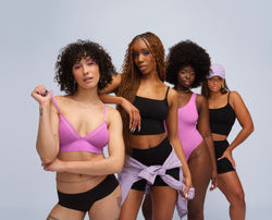
Fall 2024:
This campaign launched to spotlight seamless, versatile intimates designed to move effortlessly between underwear and outerwear — pieces that are as comfortable as they are visually compelling. The strategic intent was to position these styles as cravable essentials, expanding how consumers imagine when and how intimates can be worn.


The creative direction reinforced this flexibility through simple, confident visual cues. Models appear in synchronized lines or relaxed groupings, styled in tonal or monochromatic looks that emphasize movement and ease. A soft gray backdrop and diverse body representation keep the focus on form, comfort, and authenticity, creating a mood that feels natural and self-assured rather than overly produced.
 |  |
|---|---|
 |  |
 |  |