
Luxe Cosmetic Campaign
This self-initiated strategic case study reimagines LaMonique Cosmetics through an elevated luxury lens, positioning Glow as both a brand refresh and a unifying creative platform.The concept explores how confidence, sensuality, and inclusivity can coexist within a modern prestige beauty narrative. A clear point of view connects branding and campaign work into a cohesive system.
Developed as an exercise in translating long-range trend forecasting into a scalable system, Glow extends beyond a single aesthetic moment. Drawing from color and mood signals projected to influence the 2027–2028 runway landscape, the platform informs visual identity, campaign expression, and tonal consistency across touchpoints.
Through warmth and radiance, the work balances intensity with restraint, inviting the viewer into an aspirational, embodied experience of beauty that feels intimate, confident, and emotionally resonant. Together, the branding and campaign work show how a clear platform can reinforce identity and build cohesive, emotionally engaging experiences over time.
By establishing a clear executional framework, this system supports confident teams, streamlines production decisions, and maintains a cohesive, high-quality expression across product and marketing.

Direction Board
Grounded in high-fashion color stories and global beauty trends, this mood board defines a luminous creative direction for the campaign. High-contrast color signals confidence and modern luxury, while softened imagery maintains warmth and approachability.
Sunrise and sunset references shape both color and form, using circular motifs to reinforce glow, continuity, and longevity. The result is a cohesive visual system that translates trend insight into emotionally resonant, scalable expression.

Mock-Up Logo
Inspired by prestige beauty cues, this circular mark was designed to balance softness and strength — reinforcing LaMonique’s positioning as both inclusive and elevated. Refined curves and subtle embossing introduce a tactile quality intended to translate well across packaging and physical touchpoints, signaling premium quality without excess.
The form was chosen for its versatility and recognizability, allowing the logo to function as a quiet anchor within a broader visual system rather than a dominant statement.

Mock Up Ad
This concept captures the effortless allure of magic hour, where light feels soft, etheral, and full of possibility. The model's skin shimmers as golden light kisses her face, while circular elements echo the campaigns luminous theme. A dedicated space for an artful product shot completes the composition. This ad balances beauty, atmoshere and sophistication.
Mock Up Ad: This concept captures the effortless allure of magic hour — where light feels soft, ethereal, and full of possibility. The model’s skin shimmers as golden light kisses her face, while circular elements echo the campaign’s luminous theme. A dedicated space for an artful product shot completes the composition, balancing beauty, atmosphere, and sophistication.
Conceptual Instagram ad mockups created with found imagery and AI tools to explore how the Glow platform could translate into social execution.

This execution presents a repeatable lighting and art-direction system. showing how color and light can be intentionally balanced to elevate the product. The composition uses opposing tones to guide the eye with intention, maintaining the campaign’s luminous atmosphere while reinforcing focus on the product.

This execution explores a layered image system for the rebrand, using geometric framing and overlapping imagery to create depth and ambiguity. By playing with what sits in front of or behind the subject, the composition blurs the line between figure and light, suggesting Glow as both an internal state and an external force. The approach also demonstrates a flexible framework for highlighting product within layered imagery.
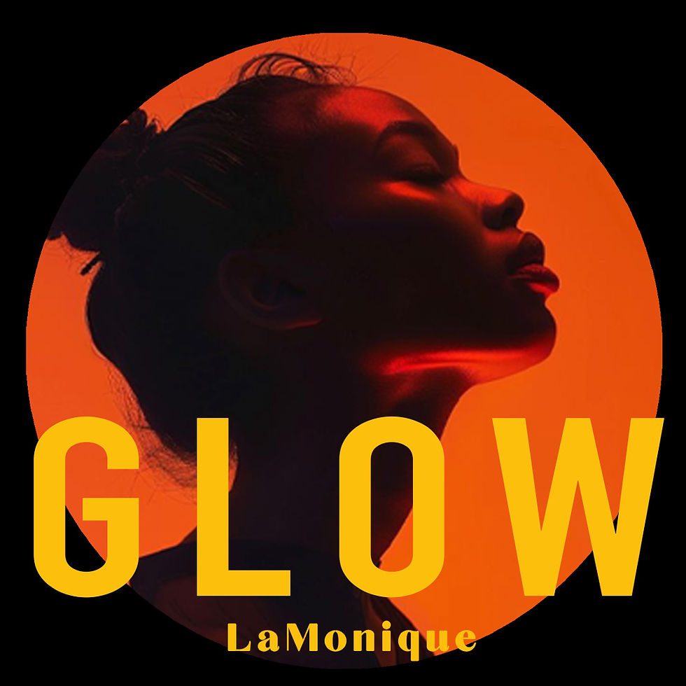
A darker, more internal expression of Glow, this execution uses circular framing and near-silhouette to create tension, positioning light as a source of hope and self-generated beauty.
This execution presents a repeatable lighting and art-direction system. showing how color and light can be intentionally balanced to elevate the product. The composition uses opposing tones to guide the eye with intention, maintaining the campaign’s luminous atmosphere while reinforcing focus on the product.
About La Monique Cosmetics
LaMonique Cosmetics is a premium beauty brand positioned at the intersection of inclusivity, ethical production, and high-performance mineral formulations. The brand emphasizes rich pigmentation across a wide range of skin tones while maintaining paraben-free, gluten-free, and cruelty-free standards, aligning product integrity with modern consumer expectations.
Founded in Hasbrouck Heights, New Jersey, LaMonique was established to expand representation within prestige beauty. Its positioning centers on confidence, authenticity, and accessibility, framing inclusivity not as a campaign message but as a foundational brand principle and baseline expectation for contemporary beauty brands.